

Lingoda (B2B/B2B company)
Year:
2026
Duration:
2 weeks for foundational setup
Role:
Lead UX/UI Designer
Team:
T. Hariki - UX/UI, L. Carville - Frontend dev, A. Ramirez- Head of Product, A. Evans - VP Brand
▪︎ About the company
Lingoda is a global online language school that combines flexibility with high‑quality instruction. The platform offers live group and private classes 24/7 taught by certified, native‑level teachers across English, Business English, German, French, Spanish, and Italian.
Courses follow the internationally recognized CEFR framework from beginner to advanced, helping learners make measurable progress. Students can book thousands of lessons at convenient times, access 100+ hours of self‑study tools (like flashcards, quizzes, and AI‑powered exercises), and use a mobile‑friendly study area.
With structured curriculums, personalized feedback, placement testing, and certificates upon completion, Lingoda supports individual learners and professional language goals, and serves tens of thousands of students worldwide.

▪︎ About the project
Context
When I joined Lingoda, the company was operating across multiple business streams with separate design teams responsible for product, marketing website, and app experiences. While each team was delivering effectively within its own scope, there was no shared design foundation connecting these efforts.
Design decisions had evolved independently over time. Components, layouts, and visual styles differed significantly between platforms, and documentation was either outdated or nonexistent. At the same time, Lingoda was preparing for a strategic brand repositioning, shifting from serving “serious learners” to positioning itself as a premium, human-centric platform for global talent.
This moment of transition exposed a deeper structural issue: the visual layer could be refreshed, but the system underneath was not built to scale or sustain change.
Key goals
Efficiency: enable faster feature and page creation through reusable, standardised components.
Consistency: ensure a unified visual and interaction language across platforms.
Scalability: build a flexible system that could evolve alongside team needs and future product expansion.
Accessibility: embed standards at the foundation level, ensuring components are compliant by default.
The problem
Lingoda’s design ecosystem was fragmented across multiple teams. Fragmentation created multiple component versions, inconsistent layouts, and accessibility gaps. Users moving between the website and product experienced a completely different visual language, undermining trust and brand identity.
The shift toward a premium, human-centric brand intensified the need for alignment. Without a structured system, scaling the rebrand across platforms would have been chaotic and inefficient.
▪︎ About the design process
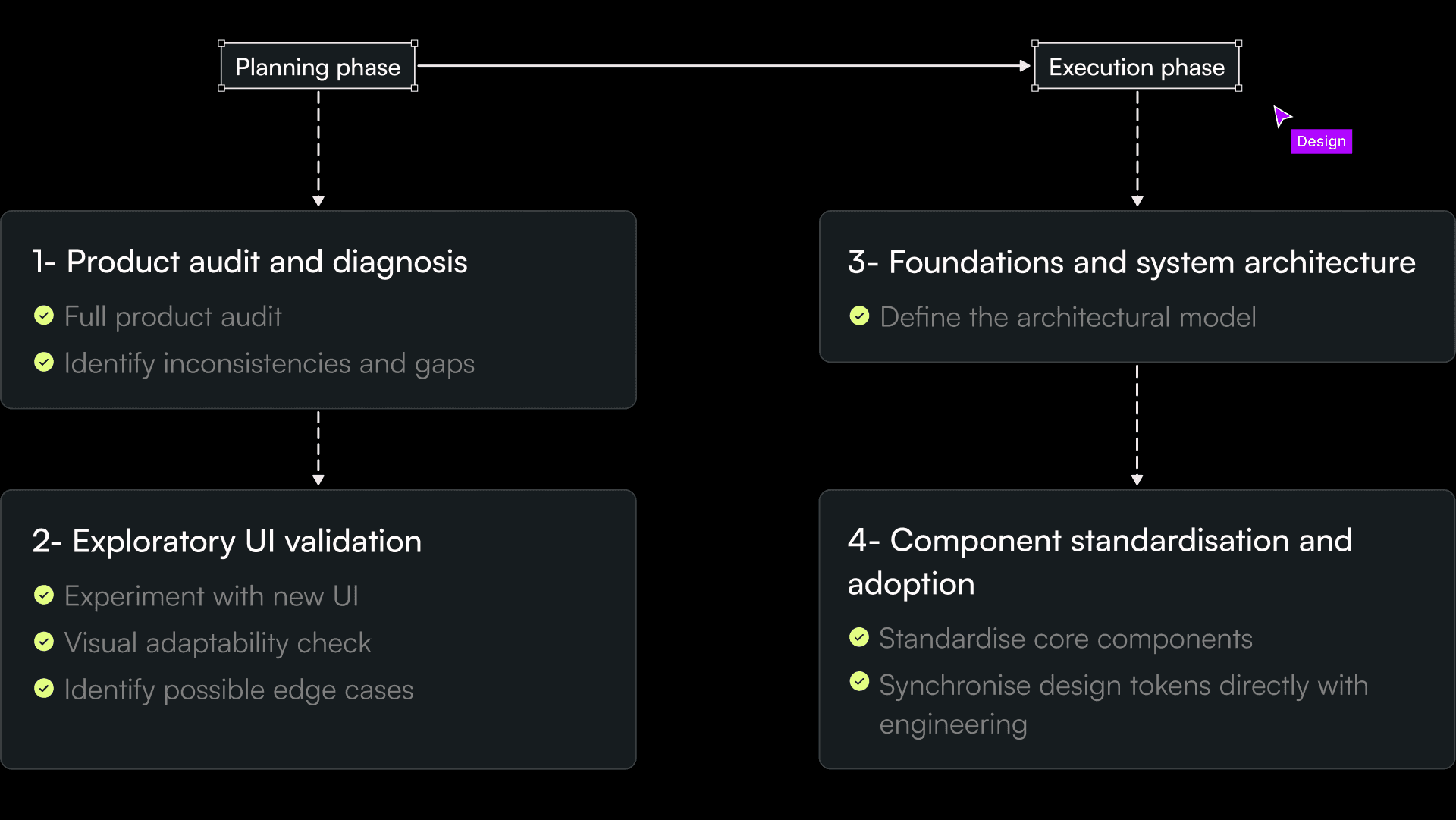
Phase 1 — Audit and diagnosis
Although we were already aware of inconsistencies, the audit made the scale of fragmentation tangible. We systematically reviewed:
- Component variations (buttons, input fields, dropdowns, etc.)
- Layout structures
- Typography usage
- Color application
- Interaction patterns
Beyond visual disparity, the audit revealed deeper structural gaps:
- No centralised documentation
- No shared naming conventions
- No accessibility standards
- No alignment between design and implementation
This phase transformed assumptions into evidence. It created a shared understanding across teams that the issue was not only aesthetic, it was also architectural.
Phase 2— Exploratory UI validation
Before formalising the system, we tested the new brand direction directly within real product contexts. Instead of defining tokens in isolation, we experimented with the new visual language: colors, typography, spacing, and hierarchy across key product and web pages.
We asked:
Does the new color palette work across complex states?
Are contrast ratios sufficient in all scenarios?
How does typography scale across dense information layouts?
Are there edge cases where the system breaks?
Phase 3 — Foundations and tokens
One of the biggest strategic decisions was how to structure the libraries across teams. Complete centralisation would ignore functional differences. Full independence would recreate fragmentation.
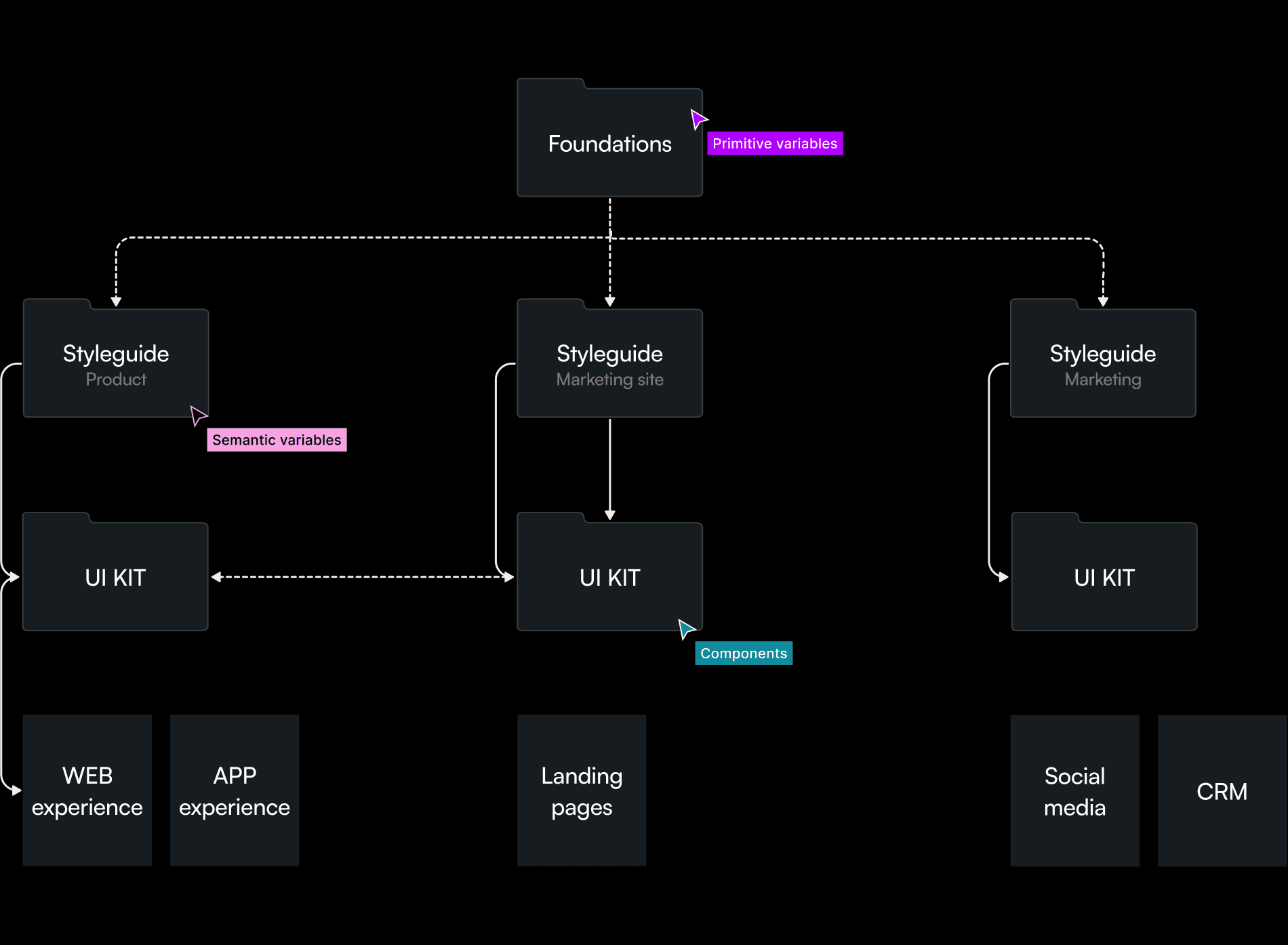
We implemented a layered architecture:
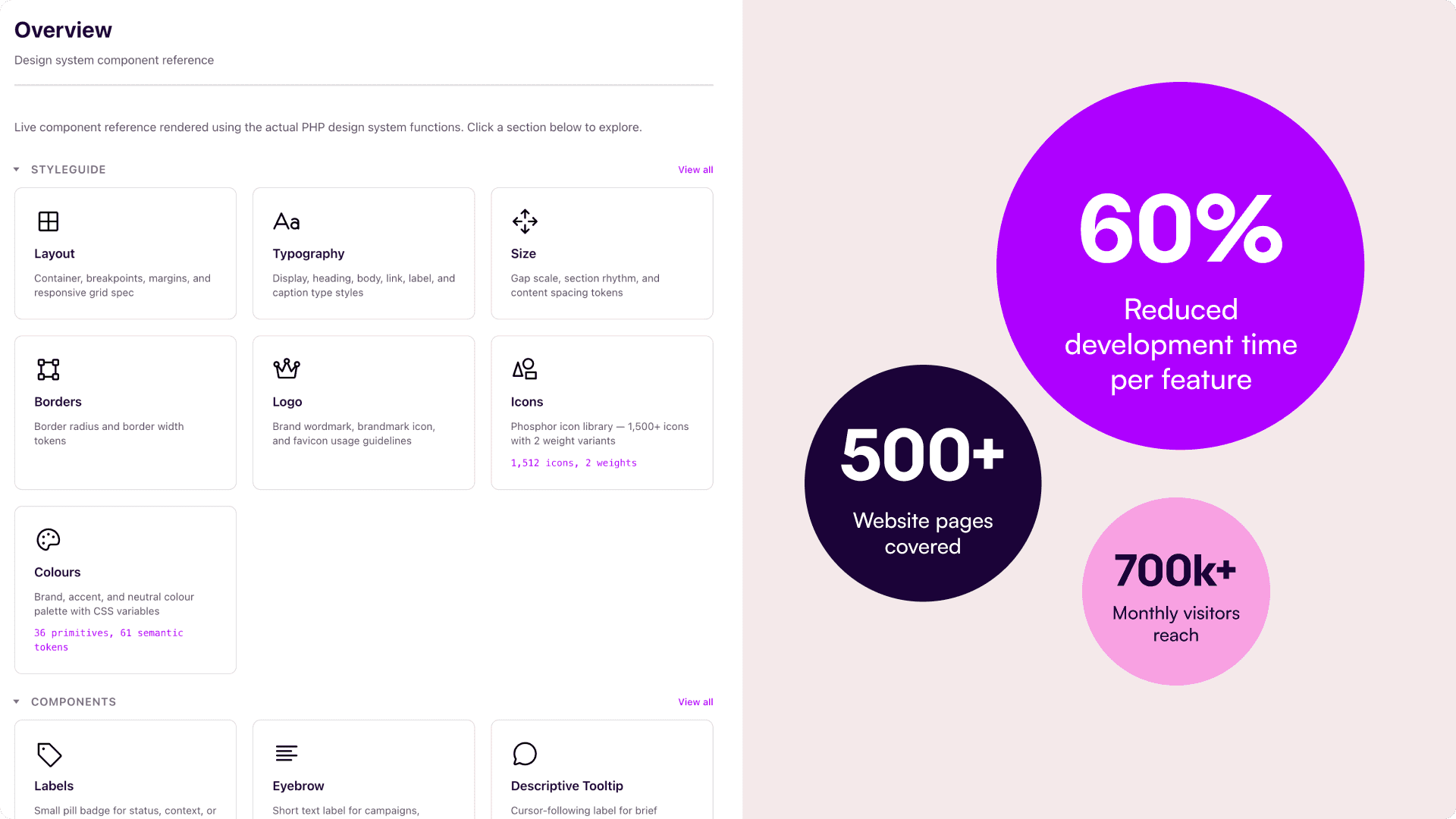
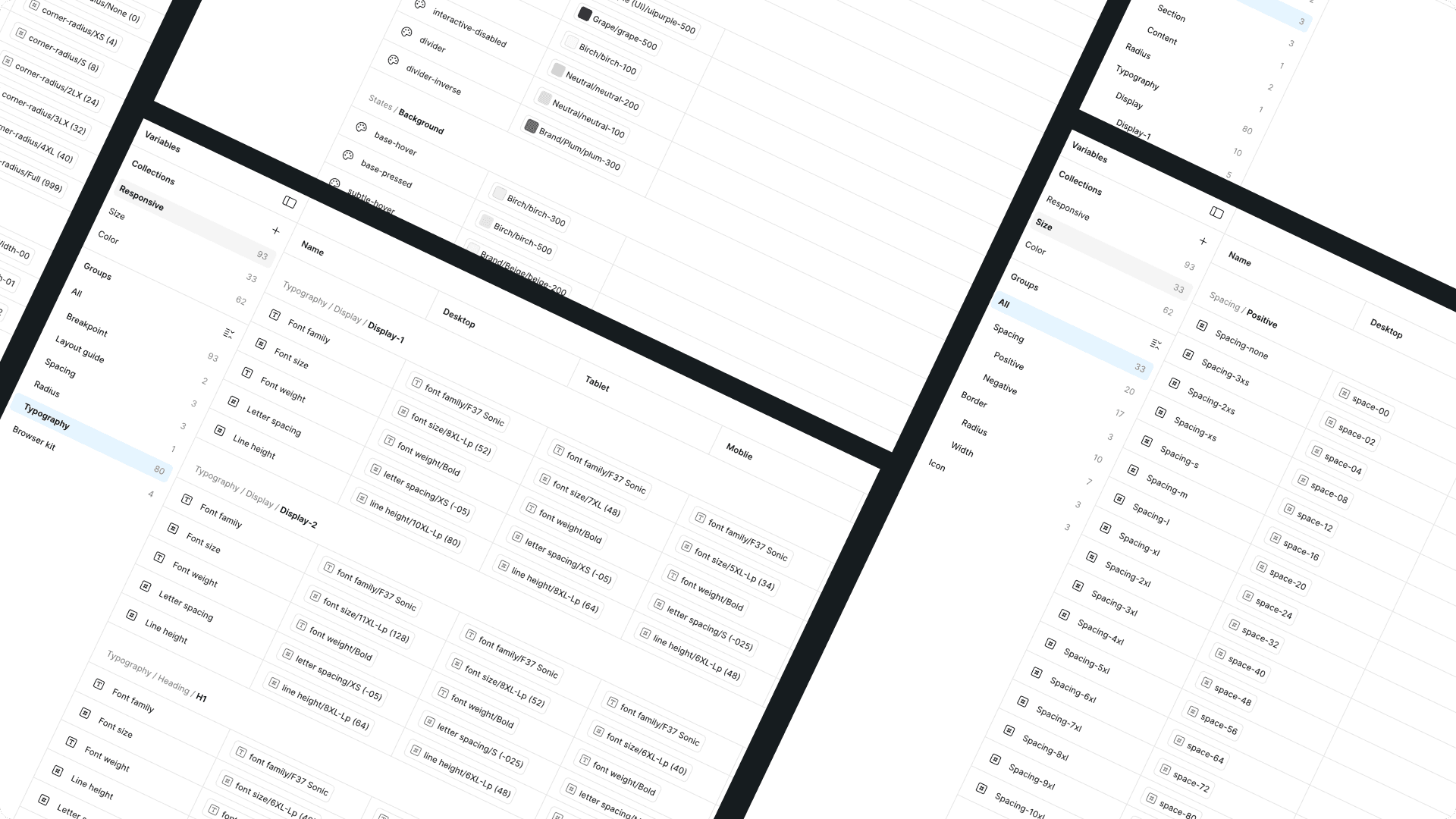
1. Foundations (primitives): we created a dedicated Foundations file where all primitive variables lived. Before this, there was no centralised foundation layer, which was one of the root causes of fragmentation.
The Foundations layer included:
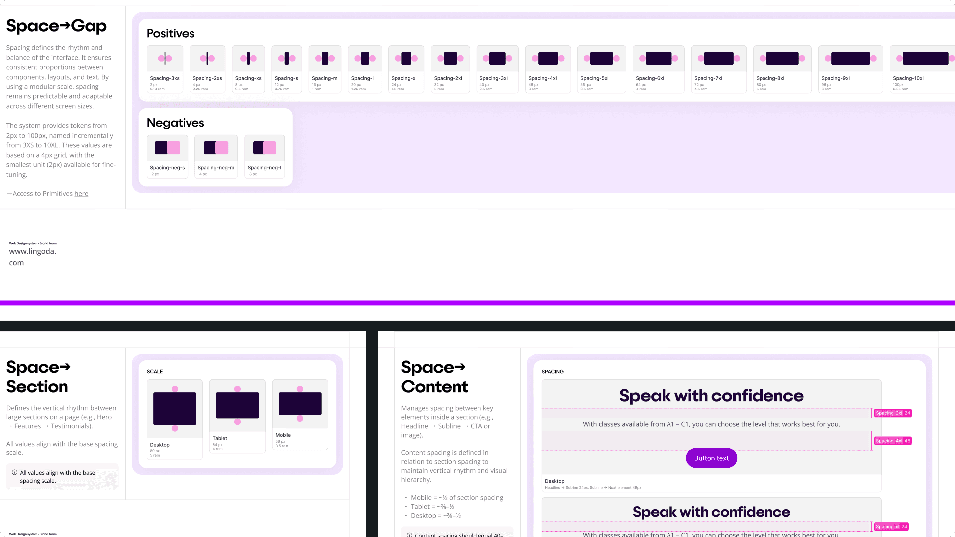
Color tokens (primitive and semantic)
Typography scale
Spacing scale
Border radius
Shadows
Grid system
Iconography
We implemented variables across all primitives. This allowed:
Global updates with minimal effort
Alignment between design and development
Token-based implementation rather than hard-coded values
Accessibility embedded at the root level
We intentionally defined the layout system first (grid, containers, spacing logic). Establishing structure before components ensured long-term scalability.
2. Style guides (semantic layer per team): each team, product, marketing and app, had its own Style guide built on top of Foundations.
This allowed necessary differentiation. For example:
Marketing required larger type, more generous spacing, and editorial hierarchy to support storytelling and conversion.
Product required denser layouts optimised for task completion and information clarity.
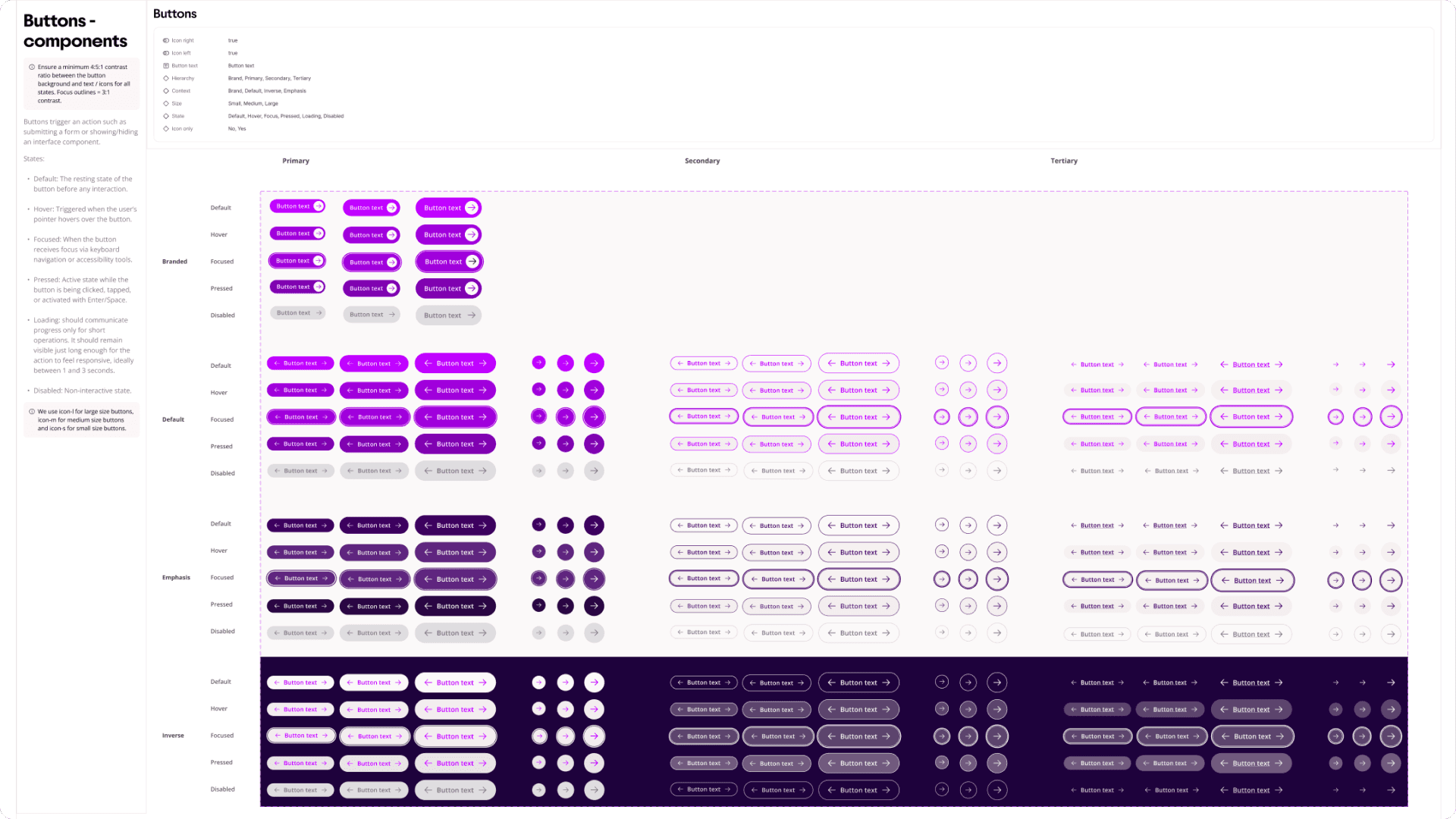
3. UI Kits (contextual component libraries): each team maintained its own UI Kit to address its specific functional needs. However, for Product and CMS, we deliberately shared a base layer of foundational components.
This meant that while layouts, density, and typographic expression could differ depending on context, the structural anatomy and interaction logic of core components remained consistent. Users transitioning between the marketing site and the product would experience visual continuity at a foundational level, even if the overall layout tone differed.
Rather than forcing identical interfaces, we aligned the underlying building blocks. This allowed differentiation without fragmentation.
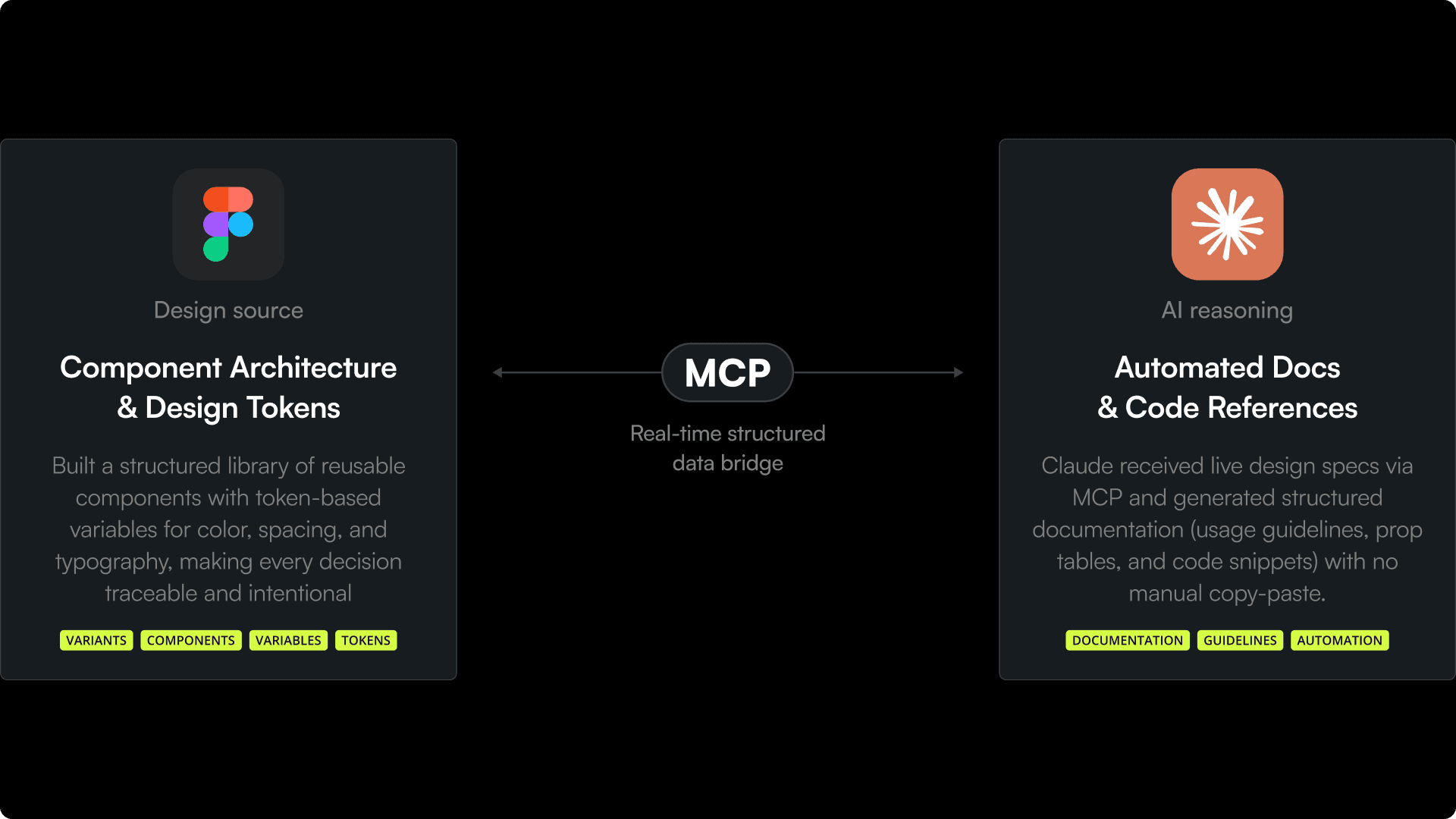
In this step, I used AI and MCP to close the gap between design and code, turning a Figma component library into a fully documented, developer-ready system:
Phase 4 — Component consolidation and standardisation
Developers consumed tokens directly, meaning design and production shared the same semantic foundation. This eliminated mismatches between Figma and code.
To ensure governance and adoption, we introduced Storybook as the shared source of truth for the first time. This became the live reference for implementation and allowed stakeholders, particularly CMS users, to build landing pages independently while preserving system integrity.
Rather than being a static UI kit, the system became operational infrastructure:
▪︎ Reflection
This project reinforced that fragmentation is rarely a visual problem, it is organisational. The biggest learning was the importance of cross-team collaboration: bringing teams together to discuss discrepancies, constraints, and priorities created shared understanding and reduced resistance.
Sequencing was equally critical: investing in systemic foundations before scaling the rebrand enabled faster, more confident execution.
Ultimately, this project shifted my perspective from designing interfaces to designing infrastructure, building systems that allow teams to scale consistently, evolve strategically, and deliver a cohesive experience across multiple platforms.