Ridely - B2C Company
Year:
2022
Role:
Product designer
Team:
T. Hariki- Product designer, N. Netherland - UX Copywriter, I. Zangers - Product manager, B. Gielbaga - Frontend developer
▪︎ About the company
Ridely is a digital companion for equestrians, offering tools to track training, set goals, and receive guidance from top professionals. Designed for riders of all levels, the app provides structured training programs, video tutorials, and progress tracking to support continuous improvement.
Ridely operates on a freemium model, giving users access to basic features for free while offering premium subscriptions for advanced training content, personalized coaching, and exclusive insights from elite riders. Additionally, the platform collaborates with equestrian brands for strategic partnerships and in-app promotions, creating a revenue stream beyond subscriptions. By blending technology with expert knowledge, Ridely transforms how riders train, learn, and connect with the equestrian community.
▪︎ About the project
Overview
Ridely is a mobile app that provides structured riding training programs, ride tracking, and access to professional coaches.
The goal of this project was to redesign the onboarding experience to:
Increase engagement
Improve clarity of the value proposition
Better integrate Ridely PRO
Personalise the user experience from the very first interaction
Rather than focusing solely on visual improvements, this project aimed to restructure onboarding as a strategic activation journey, one that builds trust, reinforces value, and aligns commitment with motivation.
The challenge
The previous onboarding flow had several structural limitations:
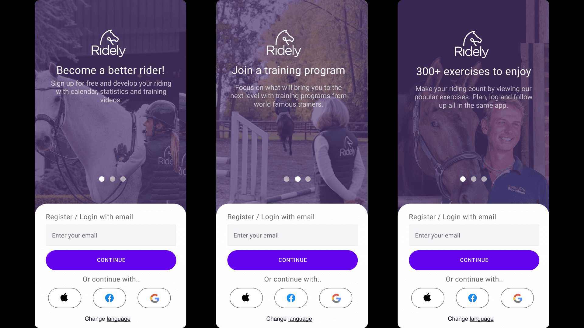
The value proposition was spread across three separate slider screens, requiring users to swipe through all of them to fully understand Ridely’s offering.
Personalisation was limited and did not include user goals.
The premium offer (Ridely PRO) felt disconnected from the journey.
The overall experience felt linear rather than progressively persuasive.
The friction was subtle but important. Users had to invest effort before clearly understanding what they would gain. In subscription-based products, clarity and timing are everything.
The challenge was to:
Reduce cognitive friction
Strengthen perceived value early
Introduce personalisation meaningfully
Integrate PRO as a natural extension, not a sales interruption
The solution was a new onboarding flow that was more visually appealing, user-friendly, and conversion-driven.
▪︎ The redesign
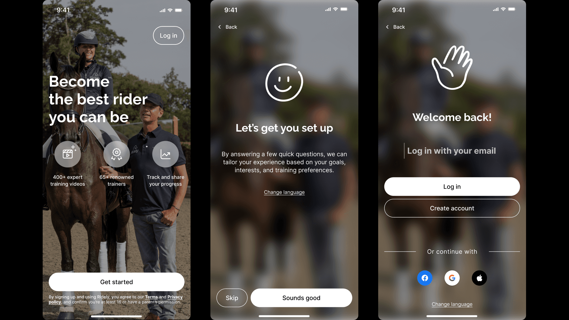
1. Welcome & Value Compression
The previous onboarding began with a 3-screen slider explaining Ridely’s value proposition. Users needed to swipe through each screen to understand the offer.
This created passive consumption and delayed clarity.
UX Decision: Compress 3 screens into 1 high-impact entry point.
The new welcome screen:
Features one of Ridely’s most well-known trainers
Immediately establishes credibility
Communicates the strongest value propositions upfront
Creates excitement and perceived quality
By consolidating the message into a single, focused screen, we:
Reduced friction
Eliminated unnecessary interaction
Increased immediate clarity
Elevated brand authority
Instead of discovering value gradually, users now see it instantly.
The first screen answers:
“Why should I care about this app?”
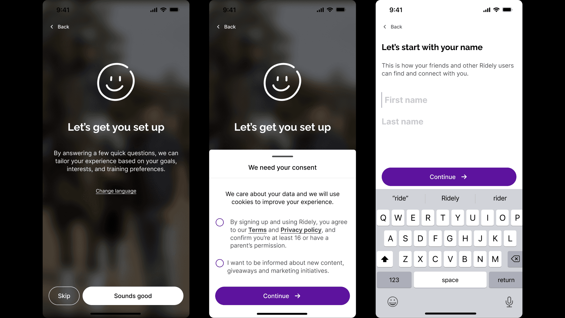
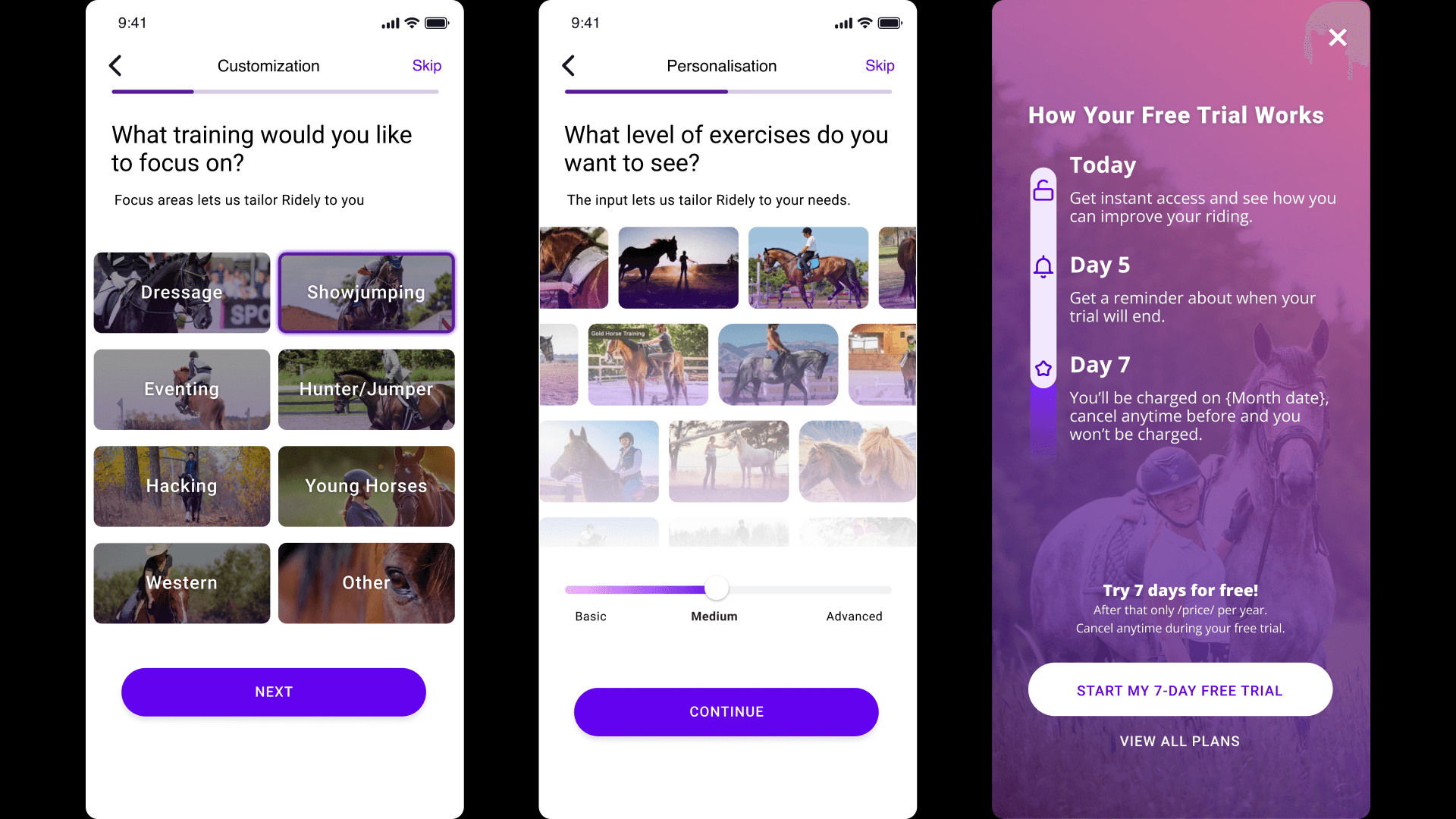
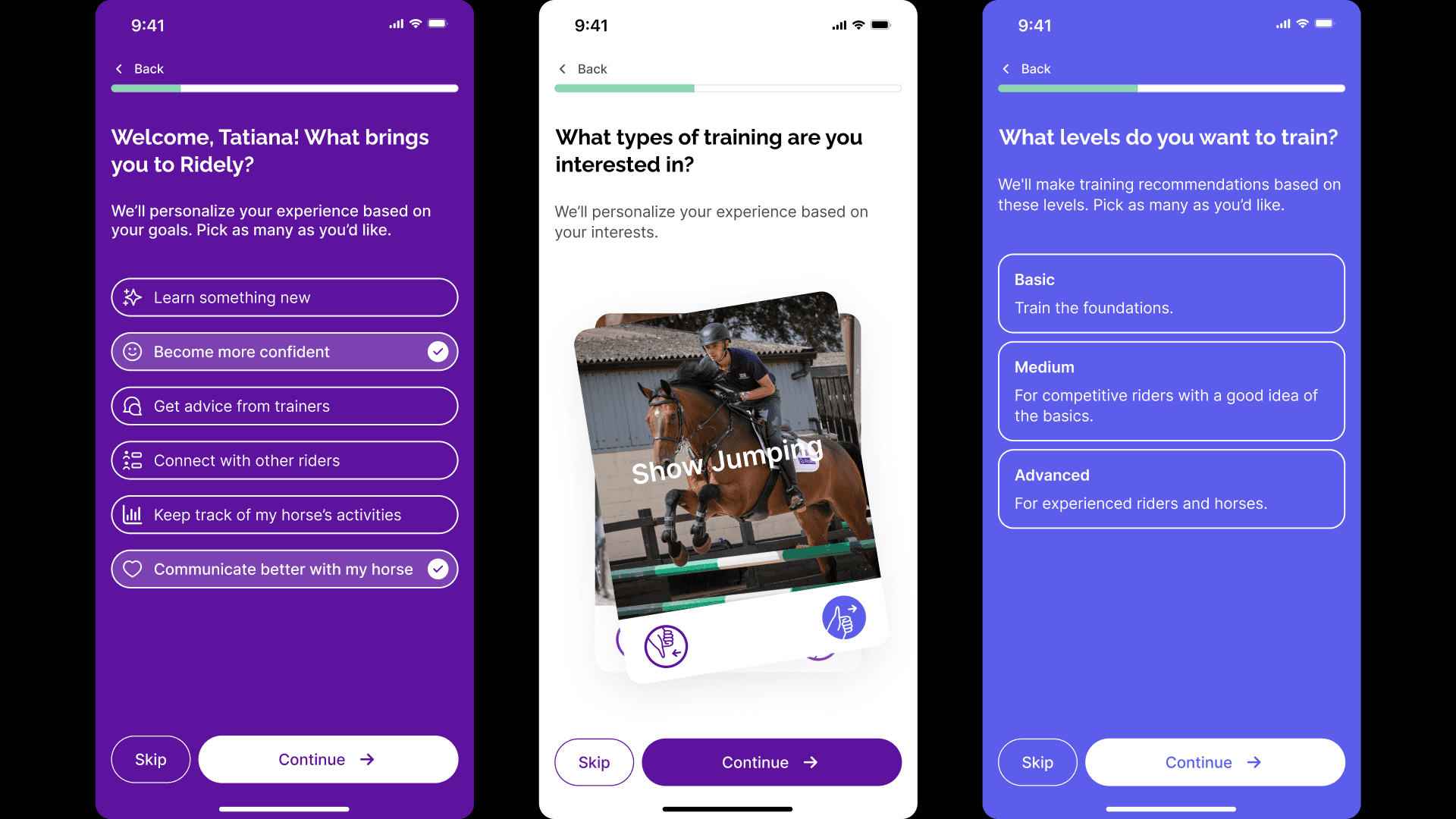
2. Personalisation as meaningful impact
The previous onboarding did not include user goals, a critical motivational driver.
We introduced a short set of focused questions about:
Riding experience
Goals (new addition)
Interests
This was not just data collection. It served two purposes:
Increase psychological investment
Enable true personalisation in the home experience
UX Impact
By including goals, the app could:
Display more accurate videos
Suggest relevant training programs
Create a more tailored home feed
This closed the loop between onboarding input and in-app output. When users enter the app, they immediately see content aligned with what they expressed. Personalisation became visible, not abstract.
This strengthens perceived intelligence of the product.
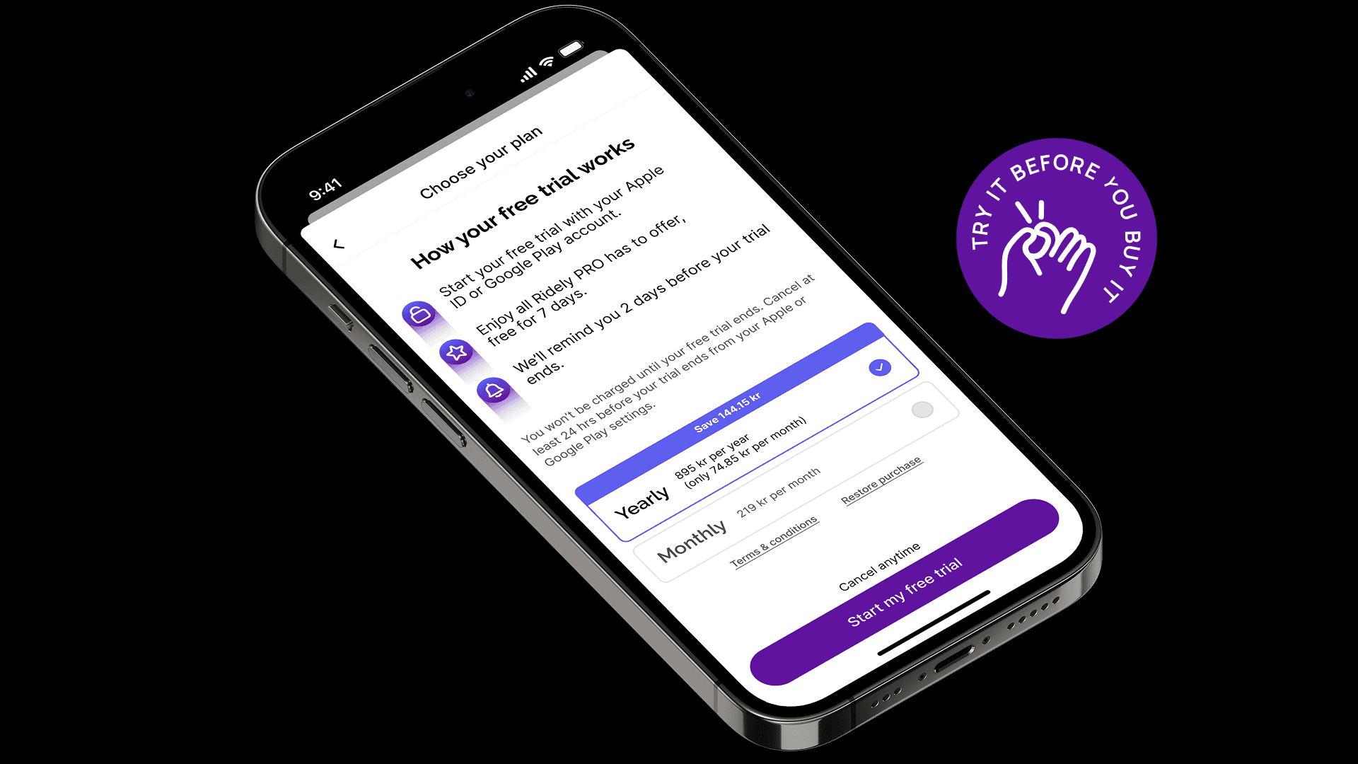
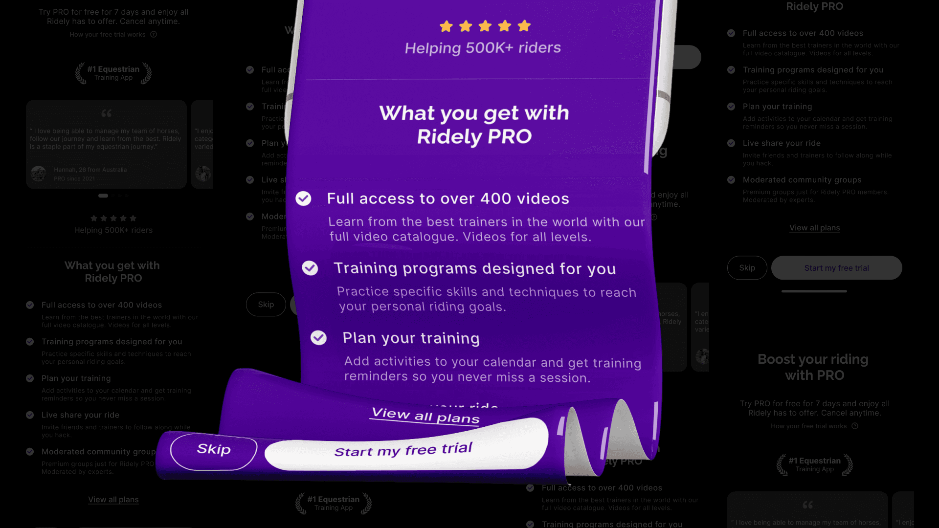
3. Strategic Ridely PRO Introduction
Rather than presenting PRO as a separate sales push, we integrated it into the flow after users had:
Understood the core offering
Reflected on their goals
Seen what the app can provide
This timing matters. The PRO screen combines three strategic elements:
1. Free Trial: users are offered a free trial as a low-risk entry point. This reduces commitment anxiety and reframes the decision as exploration rather than purchase.
2. Testimonials: social proof builds legitimacy. By showing real user experiences, we reduce perceived risk and strengthen trust. Testimonials help answer: “Does this actually work for people like me?”
3. Feature Breakdown: a clear summary of premium features ensures users understand:
What they unlock
What differentiates PRO
Why it aligns with their goals
The objective was informed persuasion.
Not urgency. Not pressure.
But clarity.
4. Transparent Subscription Selection
Users are presented with clear pricing options, with the yearly plan emphasized as best value.
However, transparency was a design principle.
Key decisions:
Clear pricing structure
No hidden conditions
Obvious skip option
Balanced visual hierarchy
In subscription onboarding, dark patterns may increase short-term conversion but erode long-term trust. The goal was sustainable activation.
5. Seamless Transition into the App
Once users decide, whether starting a trial or skipping, they transition directly into a personalised home screen. This reinforces a key UX principle: effort must translate into visible value.
Because personalisation was built into onboarding, the first in-app experience reflects:
Their riding level
Their goals
Their interests
Outcome
After the redesign, 65% of new users completed the onboarding flow, up from 38 % with the previous version.
The redesigned onboarding:
Reduced unnecessary friction
Compressed value communication
Introduced meaningful personalisation
Integrated PRO strategically
Preserved trust through transparency
Strengthened perceived product quality
Even without introducing new core features, restructuring timing, hierarchy, and personalisation logic significantly elevated the activation experience.
▪︎ Reflection
This project reinforced that onboarding is not just a visual sequence, it’s a guided decision-making journey.
I learned that:
Compressing and clarifying value early reduces friction and increases completion.
Personalisation is most effective when users immediately see the results of their input.
Timing matters: introducing PRO at the right moment aligns commitment with motivation.
Transparency builds trust, especially around subscription decisions.
If we had more resources, I would have run additional A/B tests to validate hypotheses, measure hesitation points, and optimise the flow further. Due to limited development bandwidth, we focused on qualitative UX analysis, user feedback, and heuristic evaluation.
Onboarding is where product strategy, user psychology, and business goals intersect. Even small, thoughtful adjustments can have a noticeable impact on engagement and perceived value.
The old onboarding