

Lingoda - (B2C/B2B Company)
Year:
2026
Duration:
8 weeks, plus a QA week before launch
Role:
Sole UX/UI Designer — Marketing Website
Scope:
14 pages redesigned end-to-end · 500+ pages restyled by the CMS team via the design system I built and scaled
Related project:
▪︎ Overview
Context
Lingoda's brand had been built reactively, modernised in a silo before a positioning strategy existed. It served us, but it didn't speak to the audience we now exist for: Global Talent. The 2026 brand refresh was our chance to elevate it.
I led the marketing website strand as the only UX/UI designer on it, 14 full redesigns, and the design system that let the CMS team carry the new identity across 500+ pages. The work I'm proudest of isn't a single page. It's the crossover I coordinated with Product, the buttons, the navigation, the shared primitives so that, for the first time, the brand felt continuous where the customer actually crosses from marketing into signup and product.
My role
Sole UX/UI designer on the marketing LP. I owned design, contributions to the shared design system, QA, and rolling handoff to the CMS team and engineering.
The new brand identity itself, logo, color, typography, illustration, brand book, was developed in parallel by Verve, an external agency, since our in-house brand bandwidth was committed to revenue work. My role was to translate their brand book into a working UI system: components, patterns, page templates, and design tokens.
Around me: Bruna M. and Madi W.- marketing designers, Riya D. copywriter applying the new TOV, Lewis C., Veronica C. part of the CMS team executing the reskin and building the new pages, Adrian E., the VP of Brand.
▪︎ The design process
Three layers, split ownership
With a 2-month design window and 500+ pages in scope, treating every page equally was impossible and unnecessary. We split the site into three layers, with ownership divided between me and the CMS team:
Redesign — me. 14 strategic surfaces where the existing structure no longer served Global Talent. Homepage · 6 language pages · Lingoda Flex · Flex pricing · Lingoda Sprint · Sprint pricing · How it works · Press · 404. Navigation . Footer.
Layout refresh — me. Pages where structure worked but composition needed updating.
Reskin — CMS team, via the design system I built. The long tail of 500+ pages.
The reskin is the layer I'm quietly most proud of. I didn't do it, the CMS team did, and shipped it at a scale a single designer never could. What made it possible was the design system I'd built in the previous phase and kept scaling as the rebrand progressed. Every component I designed for a redesigned page became a tool the CMS team could pick up somewhere else.
Handoff wasn't at the end. Every page went to the CMS team the moment it was done, so their reskin work moved in parallel with my redesign work all the way to launch. A dedicated QA week before launch was where I logged and triaged bugs with engineering.

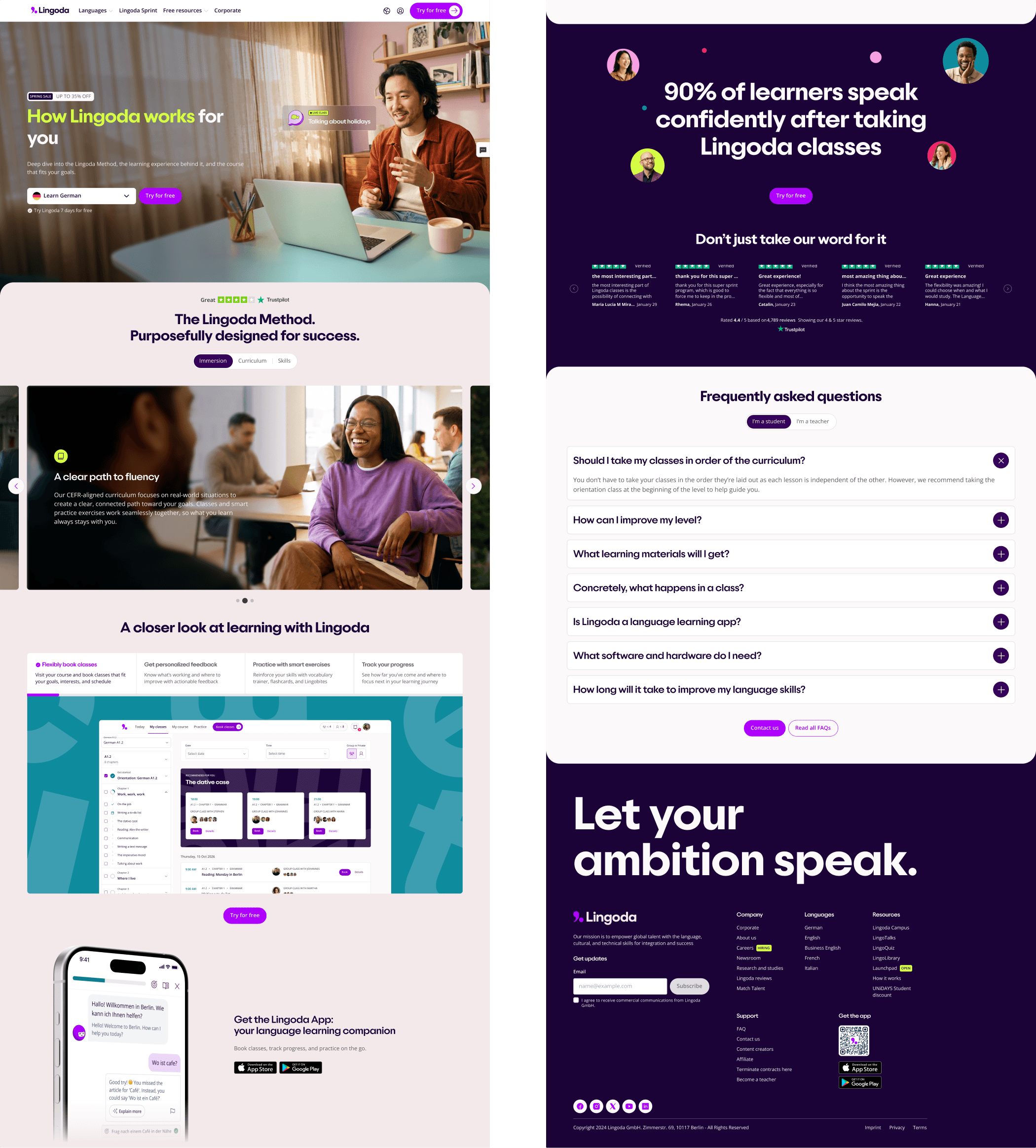
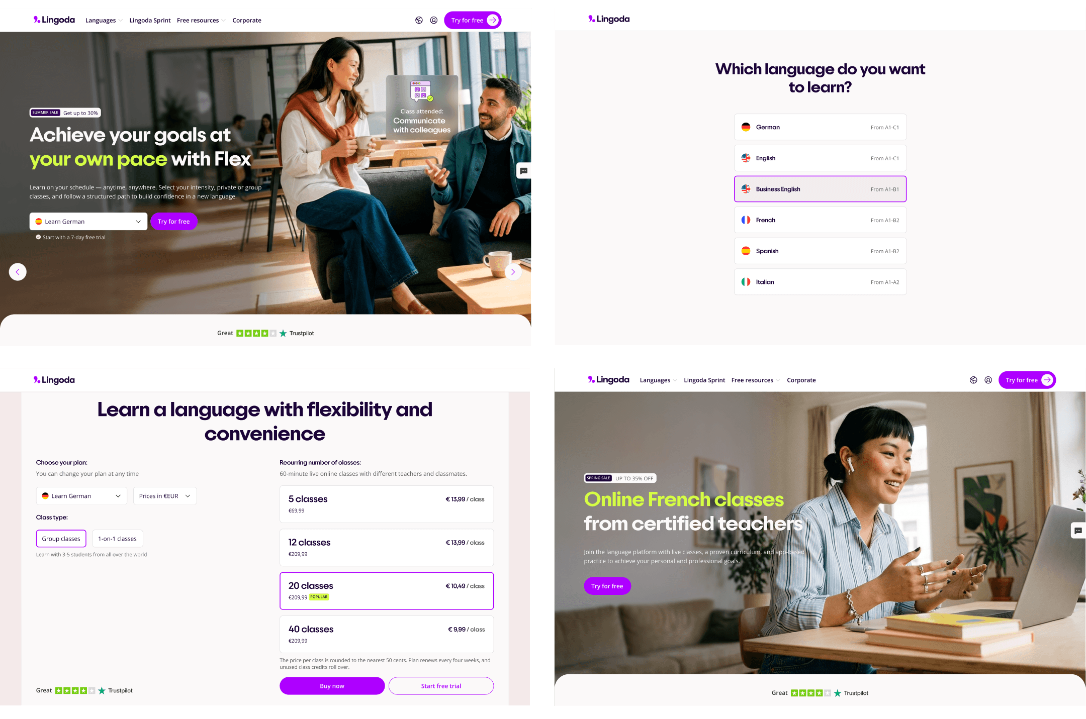

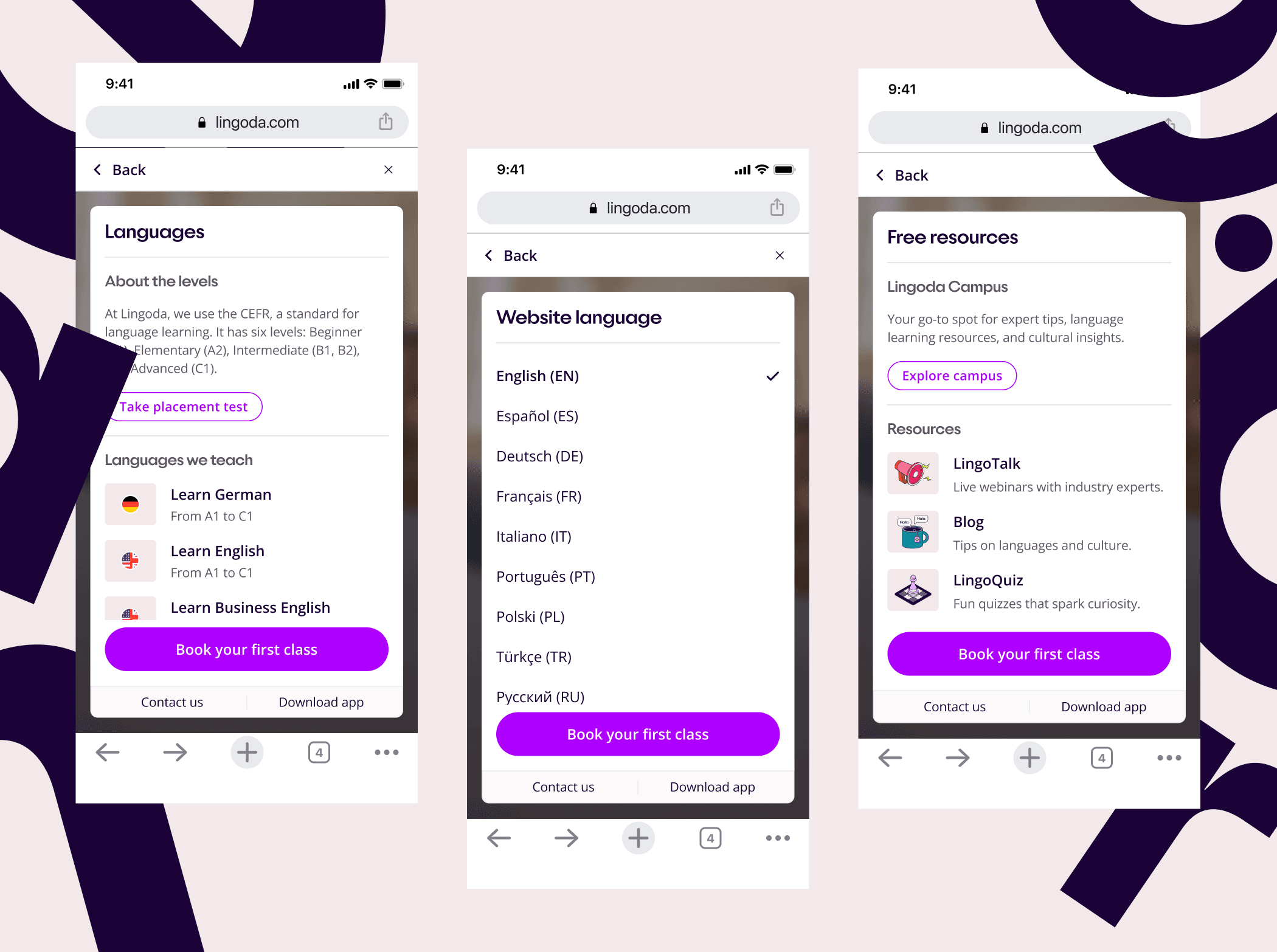

The hardest problem: making the crossover seamless
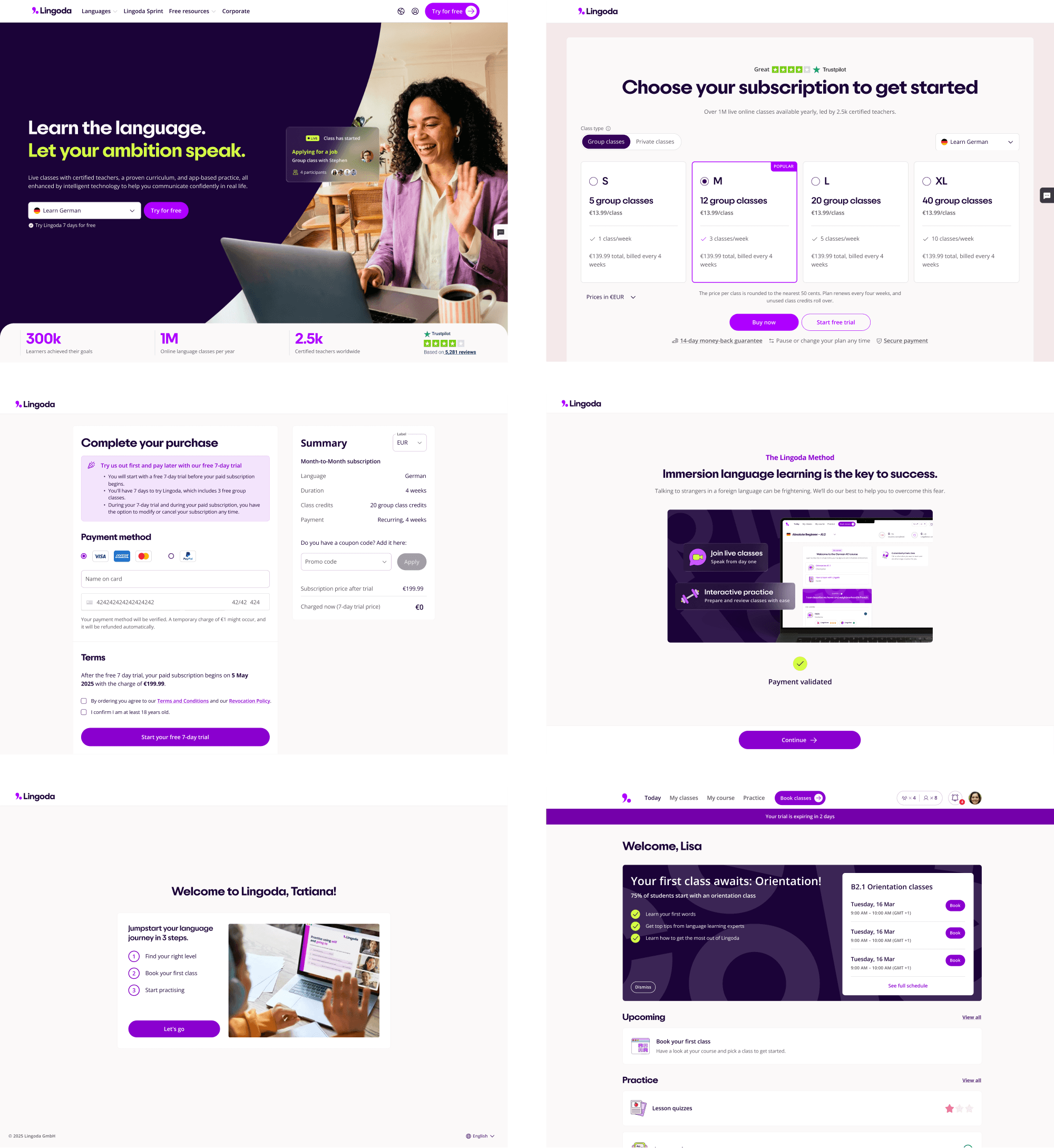
Marketing was redesigning. Product was reskinning. Both were shipping at the same moment. If our nav bar didn't match, if our buttons drifted, Global Talent would feel it the second they crossed from a marketing page into signup.
But not every component had to be identical. Forcing every component to be shared would have hurt both. The real design work was figuring out where Marketing and Product had to meet, and coordinating those specific components, while letting the rest adapt to each team's context.
I designed many new components from scratch for the 14 redesigned pages: hero patterns, pricing modules, content blocks, that lived only on the marketing surface. But a small set of components were the crossover: the ones where the customer's journey actually connects the two sides.
Shared primitives. Buttons and form patterns adopted the same primitives across Marketing and Product, so interaction language stayed identical across the transition.
Coordinated components. The navigation bar was coordinated directly with Product designers: same dimensions, spacing, and behavior, so the moment a customer crossed from a marketing page into signup, the anchor of the interface didn't move.
A layered system architecture. Foundations (tokens, typography, spacing, grid) were shared across all teams. Style guides differentiated per team: marketing editorial, product dense. UI kits stayed contextual, with a deliberately shared base layer of core components between Product and CMS. Differentiation without fragmentation.
At launch, the brand felt continuous across marketing → signup → product. For the first time.
Before
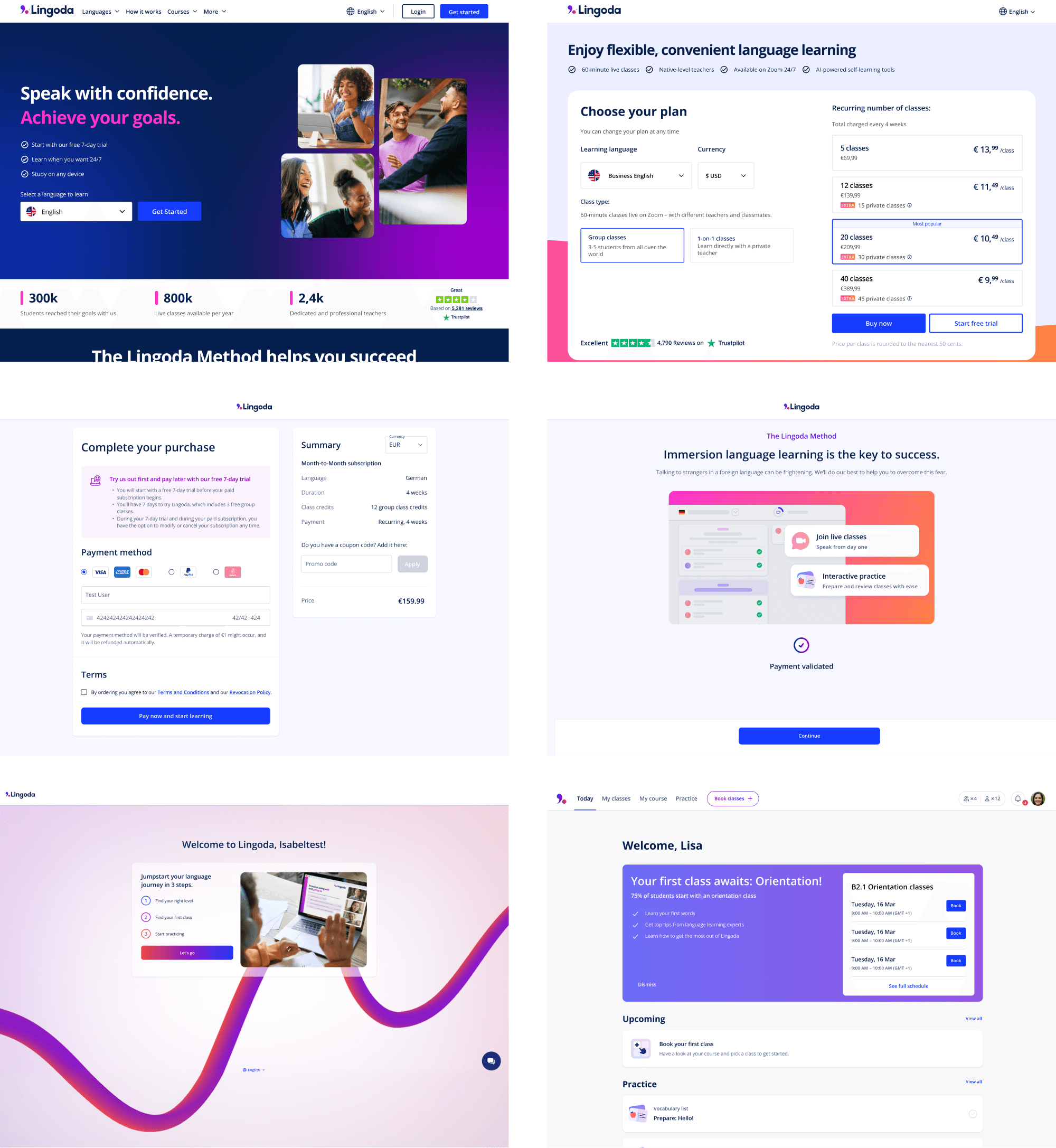
After
▪︎ Outcomes
Two success metrics were defined for this project: one quantitative, one qualitative. Both moved.
Visit-to-pricing conversion - GA4
+24% relative lift across core markets.
Visit-to-pricing conversion across the US, Germany, France, UK, Switzerland, Spain, and India rose from 13.2% → 16.4% in the two months after launch, versus the two months before.
Turkey, France, and the US saw the largest gains (+41 to +46% relative).
Germany, already a high-converting market, improved further.
9 of 15 markets analyzed improved. Declines concentrated in already low-conversion markets (China, Singapore) and smaller LatAm markets where the brand hasn't been fully localised.
The blended global total dipped 3%, but only because lower-intent markets grew disproportionately in traffic share (China nearly doubled), not because the refresh underperformed.
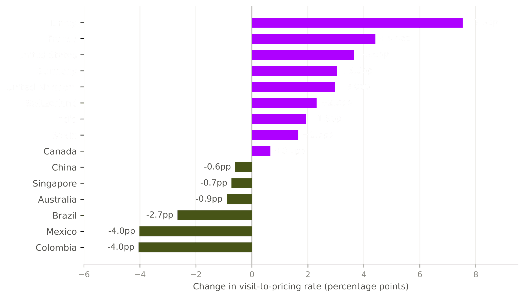
Methodology: GA4 Funnel Exploration, session_start → pricing page view. Windows: Mar 12 – May 11 (pre) vs. May 12 – Jul 13, 2026 (post).
2. Brand perception research (pre/post)
Tested with 18 Global Talent participants via UserTesting Panel, across six brand axes. The new homepage was perceived as significantly more premium, ambitious, and unique:
Axis | Before | After |
|---|---|---|
Accessible → Premium | 4.1 | 4.7 |
Casual → Ambitious | 4.8 | 5.3 |
Generic → Unique | 4.9 | 5.3 |
Participants described the target audience in their own words as "career-oriented professionals" and "expats moving abroad", almost word-for-word the Global Talent definition. Brand personality evolved from "vibrant community teacher" to "tech-savvy professional mentor."
The honest trade-off. The premium direction came with a cost. "Legitimate, established educational institution" dropped from 4.5 → 4.1, largely because in the first version of the website we removed the Trustpilot widget from the hero section and moved the social proof elements below the fold. Similarly, "The tone aligns with my standards for a professional service" decreased from 4.8 → 4.2. Participants attributed this to a perceived overemphasis on career progression at the expense of everyday-life integration and the cultural context that sits at the core of our mission.
▪︎ Refection
What I take from this
A design system is how a team of one ships at the scale of a team. The 500+ page reskin wasn't me, it was made possible by the system I'd built.
A component is "done" when it survives the use case you didn't design it for. Designing the nav bar to also work for Product forced harder, better decisions than designing it just for me.
Repositioning is a balancing act, not a swap. We made the brand feel premium, and lost a bit of supportive warmth doing it. Premium isn't the absence of warmth; it's warmth that takes itself seriously.